Streamlined Vacation Booking
4 - Step Flow, Resulting in 3x Higher Conversions
Manager of Information Architecture and UX @ Interval International
The Problem
Outdated vacation booking workflow and backend systems with certificate-based UI caused confusion as to what resorts and areas could be booked into, which resulted in high abandonment rates and low engagement.
My Role
-
Led end-to-end UX overhaul, from heuristic analysis to final mockups
-
Introduced a story-driven pre-login homepage to showcase value before entry
-
Created wireframes, search UX, and designs in Figma
-
Guided flow restructuring to reduce checkout steps from 8 to 4
-
Collaborated across engineering and ops to fit the legacy system constraints
-
Designed agent-facing access for resort-side certificate registration
Deliverables
Live Product: Dream Vacation Week
Deliverables: Heuristic Review, User Flow, Sketches, Wireframes, Mockups
Project Type: Early wireframe prototype
Team: Senior Product Designer (me), 1 UI Designer, 1 Java Developer, 1 Product Manager


The Challenge
-
Certificate system was confusing and not intuitive compared to other OTAs
-
8-step checkout caused friction and high abandonment
-
No room size selection, outdated filters, and zero responsiveness
-
Legacy backend limited what we could change behind the scenes

Key Decisions/Moves
Constraint
Legacy backend & login friction
Long, outdated booking flow
No room size or traveling party selection
Decision
Introduced pre-login storytelling to build user trust early
Reduce booking flow from 8 to 4 steps and added intuitive filters to help reduce undesired travel options.
Introduced modern filter set + room details upfront
Impact
Increased trust and engagement before commitment, helping visitors understand the product's unique value proposition vs traditional travel products
Testing this new format resulted in faster conversions and fewer drop-offs during critical moments of the checkout flow
Improved booking confidence and user satisfaction which translated in to 3x more bookings
The Work
Heuristic Review
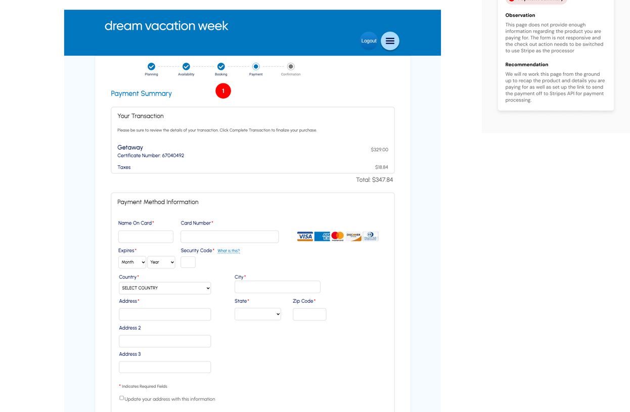
Pain point callouts revealed 8-step flow friction and mobile usability gaps
Early UI Sketches
These early sketches provide a visual of the initial creative process as requirements are applied to the UI to craft the new experience


Business Outcomes
+15%
improving conversion rate from 1.5% to 2.22% and increasing completion rates by 15%
8 > 4
Cut checkout flow from
8 steps → 4 resulting in lower drop off rates
+Filters
OTA-style filtering and room selection improved user control
Leanings & what's next
This project reminded me that simplifying complexity isn't just about design—it's about seeing friction early, and building flow around how people already think when they plan a trip.
Complex business rules and backend limitations do not have to create a user interface that introduces that complexity to the customer, you just need to think creatively and work with your team to work around those limitations.


