Redesigned Corporate Site →
+31% Lead Growth & Partner Clarity
Manager of Information Architecture and UX @ Interval International
The Problem
Interval International’s corporate website was long overdue for a major overhaul. It wasn’t responsive, it had an outdated visual identity, and broken links were scattered across key pages. Internally, it was difficult and expensive to update anything — there was no centralized CMS, which meant even small content changes required engineering support.
The marketing and sales teams had no way to keep the site fresh or tell a compelling story to potential partners. On top of that, there was no consistent voice or brand narrative, and no real structure in place to support lead generation. The site wasn’t just behind the curve — it was holding the business back.
Objective: Improve lead generation and reposition Interval as a high-value partner for developers and future members.
My Role
-
Co-led strategy and UX for the full relaunch of Interval International’s corporate site, serving both B2B and B2C audiences
-
Worked with marketing, sales, and corporate teams to align goals, gather requirements, and prioritize key features
-
Defined the content structure and helped shape messaging when none was initially provided
-
Facilitated discovery workshops and journey mapping to uncover pain points and align business priorities
-
Created interactive wireframes that guided the design system and helped estimate dev scope for external contractors
-
Collaborated in Figma with design and external dev teams to maintain alignment and stay within delivery scope
-
Delivered a CMS-powered site that allowed internal teams to make updates without dev support
-
Resulted in a 31% increase in lead generation and saved the company hundreds of thousands in development time and cost
Deliverables
Live Product: Interval International Corporate Website
Deliverables: Product Discovery Sessions, Customer Journey Map, Competitive Analysis, Wireframes via Axure RP
Project Type: Fully developed wireframe prototype
Team: Senior Product Designer (me), 1 Word Press Developer, 1 Product Manager


The Challenge
-
Modernizing an outdated, non-responsive website that lacked scalability and mobile support
-
Designing a content structure and brand narrative from scratch in the absence of initial direction
-
Unifying conflicting needs across marketing, sales, and corporate teams into a single, cohesive experience
-
Enabling non-technical teams to publish and manage content by introducing a flexible CMS workflow
-
Improving the site’s ability to generate leads where previously there were no capture points or strategy
-
Aligning multiple stakeholders around priorities through discovery workshops and journey mapping
-
Managing handoff between internal design and external dev teams while keeping scope and timelines on track

Key Decisions/Moves
Constraint
The site had no real CMS, so any content changes required developer time, which slowed everything down and added cost.
There was no clear direction when it came to messaging or content structure — it was kind of a blank slate.
Each department had its own priorities, and getting everyone aligned wasn’t easy.
Sales didn’t have any way to generate leads directly through the site.
Decision
I pushed for a CMS that would give the marketing and sales teams full control over their content without needing engineering support.
I stepped in to create the content architecture and helped define the brand tone so we could tell a story that actually made sense to partners.
I led journey mapping and working sessions with stakeholders to figure out where our goals overlapped and what really mattered to users.
I made sure we integrated lead capture opportunities throughout key areas of the experience, like contact forms and gated interest points.
Impact
This opened the door for faster updates, more timely messaging, and saved the company significant time and development costs.
That gave everyone a foundation to work from and helped us build a consistent experience that supported business goals.
That helped unify the experience and prevented the site from becoming a disconnected patchwork of competing asks.
That shift led to a measurable 31% increase in partner engagement and made the site a much more valuable tool for the sales team.
The Work
Product Discovery
Clarified who we were designing for at each phase of the vacation journey — ensuring features and flows matched real member goals and expectations.

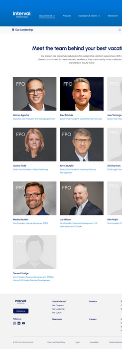
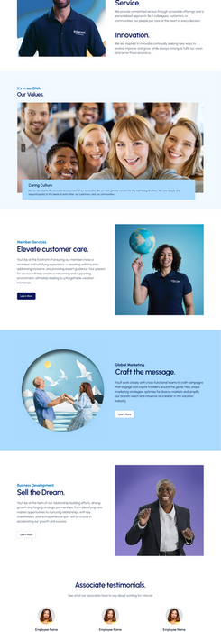
Desktop Mockups
I partnered with the UI team throughout the entire design process — from early component exploration to final layout and typography decisions. Since we were working from a brand-new design system, I helped make sure everything aligned with the vision for a more modern and cohesive corporate identity.
Home Page
The redesigned homepage introduces a modern visual system and a clear hierarchy that prioritizes partner value. Hero messaging is focused and supported by flexible modules that showcase product benefits and conversion points.
Navigation and Site Architecture
A simplified top-level nav brings clarity to the user journey. Key partner paths (like Membership, Business Solutions, and Contact) are now easily accessible within two clicks. Mega menu allows scalable growth without clutter.
Content Driven Pages
Individual product and partner pages now follow a consistent structure, with space for storytelling, lead capture, and relevant resources. The content modules were designed to be reusable within the CMS for rapid updates.
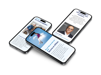
Mobile Mockups
When it was time to design the mobile experience, I helped guide the visual design team by translating my initial wireframes into responsive layouts and navigation patterns that made sense on smaller screens. I’d already mapped out how key components and content blocks should behave at different breakpoints, so I worked closely with the team to ensure the mobile version stayed intuitive, scalable, and aligned with our overall design system.

Business Outcomes
+31%
Increase in Qualified Partner Leads
+68%
Mobile and desktop site visits increased as part of the deployment of this updated web platform
+Branding
Stronger brand story for both B2B and B2C audiences
Leanings & what's next
This was a great project to be a part of and I really love that we were able to go from a creative brief basically telling us what the business wanted to a full-fledged discovery session which helped uncover so much that was being left out of the brief as well as define the desired outcomes vs just some pages on a website which was initially requested. I enjoyed working out the solution and collaborating with the different teams.


